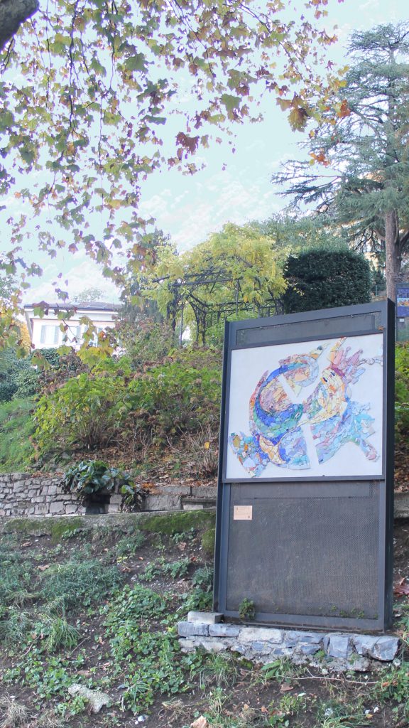
Mosaic form:
Authors: Sybille Louquet - Paris
Year of publication: 2019
Map:
Information about the work:
The splendour of the mountain, the gentleness of the water. To all those who, every summer, ask their children to choose one of the two, "Would you rather go to the sea or the mountains?" I advise them to take a trip to the edge of Lake Como.
The name alone conjures up beautiful landscapes, lush nature, and above all, the immensity of the water, in a word: majestic.
Mountain and water, then. The one that touches the sky, the other that knows the depths. The zénith and the horizon. The immutability and the vitality. The Yin and the Yang are two opposing forces and completely balanced.
My project was born out of this opposition, so I wanted to play on opposites throughout. I started from the general shape of the famous Chinese symbol tàijí tú to express the complementarity of two energies,
that of the mountain and that of water; hence the composition of the work, round. Then, I chose the colours in the same spirit, playing with complementary: warm and light on one side, cold and dark on the other.
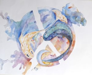
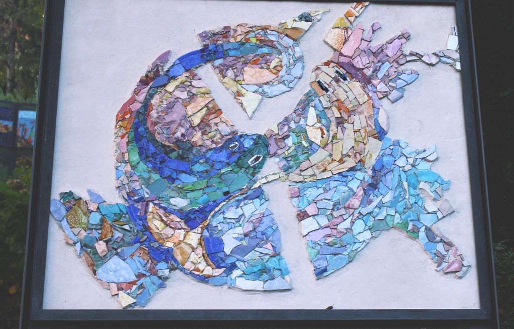
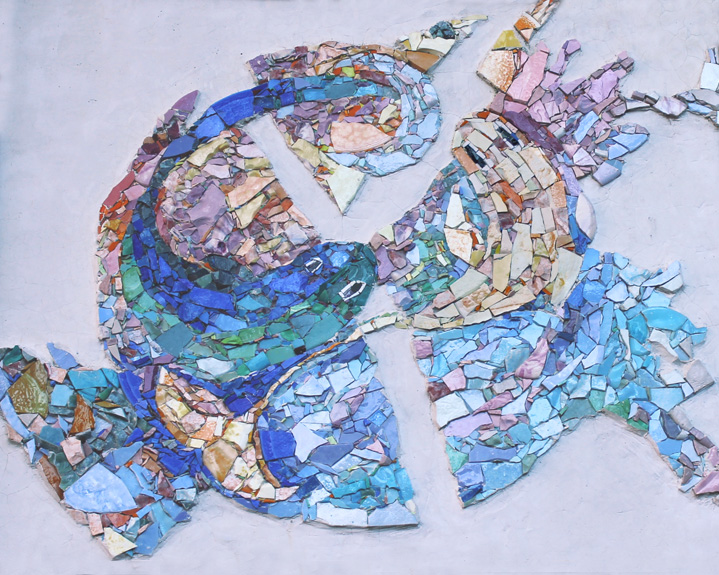
The sketch, therefore, consists of a white, rectangular background, which is stained with colours; in contrast, the central figure is that of a circle, a simplification of the highly coloured tàijí tú symbol, excluding a white part running through it, in the shape of an inverted 'Y', reminiscent of the lake.
The two fish recall the aquatic theme; instead of expressing the altitude, I decided to represent the sky in two of its most beautiful moments: sunset and sunrise. All that agrees with the spirit of Yin Yang, which in its etymology expresses the idea of two skies, one cloudy and the other shining; moreover, the fish are carp, to stay within a slightly Asian style and not lose meaning. These two animals have complementary colours; if one is more energetic, the other is more nuanced.
To sum up, I started with the beauty of the neighbouring place of Blevio and the landscapes of Lake Como expired to create my work. I wanted to express the opposition between the presence of the mountain and
water. Consequently, I was inspired by the tàijí tú, the symbol of Yin Yang, representing two perfectly complementary concepts in Chinese philosophy. From that point, I tried to create a series of contrasts, whether of form, saturation, hue, luminosity or even quality.
The splendour of the mountain, the delicacy of water...
Technique used:
Direct technique mosaic with glass paste tiles.
PROCESSING AND MATERIALS
As mentioned above, my design works by systems of opposition; one must find the same thinking in my mosaic artistry.
I want to work all the background and the "Y" in Keraflex ultra white not to weigh down a vibrant and colourful work. The "cement," directly poured on the panel, will not be too high not to increase
the weight excessively; moreover, I chose that binder because of its maximum chemical, mechanical and physical resistance. Be sure the cold or windy weather will not damage it, especially for its aesthetic appearance. In fact, unlike regular cement, which has a very rough finish, Keraflex ultra white is a cement-based powder with workability and final performance similar to that of lime for
an outstanding result. If I could not use Kerabond, I thought of another material: Marmorino. It has the same strengths, and the result is similar to lime or gypsum. Excluding these two binders is because of their low outdoor strength: they risk creating cracks or crumbling with the place's time, cold, and humidity - we must remember that we arenclose to the lake.
The result will be purified, minimalist and elegant, letting the composition breathe. I am also interested in the fact that the Keraflex parties have very different visual and tactile results from the mosaic work
that will be in the coloured part; in this way, it will be possible to create an opposition between the two segments.
Then, as I said, the coloured space will be made of tiles. I want to leave, in the concrete, a perfect area to create a mosaic inlay on the inside. I will do this by putting a clay barrier in the shape of the mosaic; after this, I will pour the Keraflex on the substrate, and once it is dry, after more or less two days, I can remove the clay and start the mosaic. My idea would be to have a maximum height of the tiles at the same level as the cement and the others below to protect the mosaic partly by the cement outline and become more durable. As I always need to work outside, I cannot use all materials at the sight of my colours - I need to exclude marbles. I was thinking of using glazes, especially those from the Morassutti company located in Spilimbergo, because they have an infinite number of shades within one piece, and they will be beneficial for me to render
the watercolour effect of the sketch.
The mosaic will have a contemporary trend and a fairly free technique that allows for both tesserae, both large and small, to follow the sketch as closely as possible; the surface will be plane but not flat, meaning that the tesserae should all be from the same height but with slightly different inclinations as I want to work directly because of timing and to make lying easier. That processing would be ideal for carrying out my project; however, being recommended by my teachers at the mosaic school in Spilimbergo, I could change my working idea if it does not do well.
I will cut all the material with a hammer and glue it with Kerabond and Isolastic, which has proven its strength over time and in outdoor spaces.
Author’s website:
Photo Gallery:
